The place branding community is constantly arguing about the value of logos and slogans.
Some view these marketing tools as useless gimmicks with little effect on a place’s reputation. As Simon Anholt said: “A reputation can never be constructed through communications, slogans and logos. It needs to be earned.”
But on the other hand, there are those who still believe that meaningful logos and smart slogans are important elements of good branding campaigns.
The reality, I believe, lies somewhere in between those two opposing standpoints.
Logos as focal point
While no-one can reasonably expect a logo to magically rejuvenate a place’s ailing reputation, we can nevertheless expect a strong and relevant logo to act as a focal point to draw attention to the place’s key branding themes. Logos and slogans are simply tools; no more, no less. They have no innate power to change people’s perceptions of place brand identity.
Most campaigns that revolve too heavily around a new logo or slogan have limited success. This is because few logos or slogans have enough power to encapsulate place identity in a way that engages hearts and minds.
But if logos and slogans are completely useless, why are place marketing managers so crazy about them? Surely there must be at least some value, if not a magic solution.
Turning a city around
Countless banal and forgettable place logos have emerged over the years. But despite this, one logo in particular may have been instrumental in sparking significant social change in one of the world’s major cities. That city was New York.
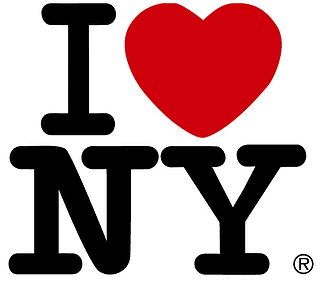
Milton Glaser’s bold ‘I Love NY’ is one of the world’s most recognisable city logos. It has been adapted, satirised, and featured on countless souvenirs.
Today, New York’s city brand is top-notch. It is considered one of the world’s most desirable cities to live in, work in, and visit.
But back in the mid-1970s New York was very different. Back then, the Big Apple was a city with serious problems - crime-ridden, drug-infested, and filthy. Mention of New York conjured up images of a dangerous and lawless city.
Nevertheless, despite the city’s low morale during these dark days, many New Yorkers still felt a great affection for their troubled metropolis. A catalyst was needed to bring these feelings to the fore, to capitalise on them in the hope that real social change would soon follow.
No cynical place brander would ever have credited a humble logo with playing a significant role in this transformation.
Back in 1977, Milton Glaser created a logo design that harnessed positivity. The bright, uplifting logo with its unashamedly uplifting message was a tangible representation of New Yorkers’ inherent love for their city. It was a love that inspired them to get involved in various social improvement initiatives. Many have credited Glaser’s logo for helping to turn New York’s image around.
Glaser himself once commented in an interview that New Yorkers experienced an abrupt ‘shift in sensibility.’ One day the streets were ‘full of dog crap’ and no-one cared. But the next day, people got sick of stepping in it and so the city began to react.
The authorities started levying $100 fines upon careless dog owners, dog crap became socially unacceptable, and the streets quickly became cleaner.
This is just one example. The enthusiasm of the people produced successful results from numerous efforts to clean up New York and make it safe. Bolstered by these achievements, the government established ambitious goals, such as mayor Rudy Giuliani’s tough crackdown on crime.
Self-fulfilling prophecy, meteoric rise
New York became a self-fulfilling prophecy. As people loved it, so it got better. The streets became safer, the subway got renovated, and new city-wide initiatives improved overall quality of life for everyone. Things were looking up for New York.
But a curious question remains: how did a simple logo captivate so many? I believe because it captured the spirit of the times in a bold way that resonated with people. People wanted to love New York.
Glaser’s logo became an iconic symbol of New York and has been widely imitated around the world ever since its launch. Any Google search will return a huge number of variations. New York City has tried many times to contest these imitations and uphold its trademark, but so far it has failed.
And as quickly as the imitations vanish, more pop up. From a place branding perspective, New York should thank the imitators for reinforcing its city brand and giving it international significance.
During the 80s and 90s New York experienced a meteoric rise. International firms fell over one another to invest there, and foreign tourists flocked to see the iconic landmarks. Shows such as Friends and Sex and the City enhanced New York’s new image and helped spread it across the world.
Digging deeper in branding campaigns
Most of today’s city branders would be proud to create a logo campaign capable of compelling people to take action for change. If only it were that easy.
But as the place branding discipline develops, and with our deeper understanding of what constitutes successful place branding, we now understand that it usually takes more than just a logo to define a place’s reputation.
We need to dig deeper into the history and culture of places, to discover their archetypes, their soul, their reality, and their desired futures.
Want to read more about Place Branding?

Check out the book from UP: Wish You Were Here.

