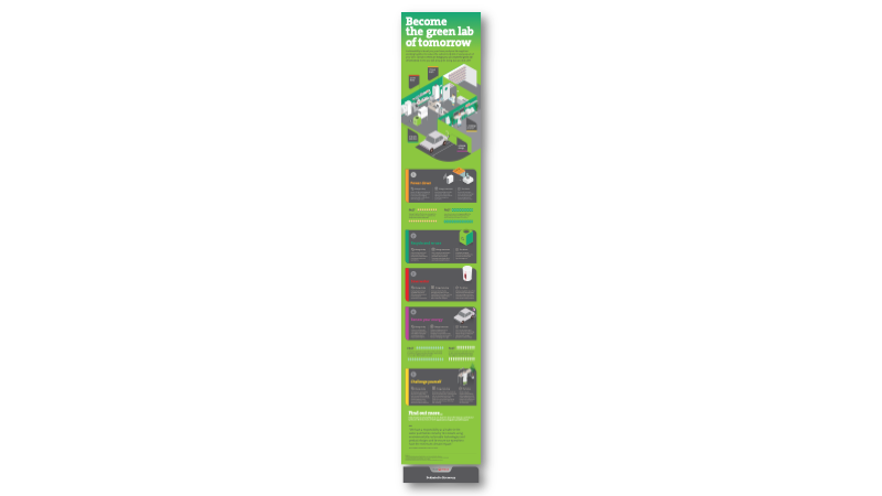
An infographic is a compelling format for visual content that you can use to expand and add interest to your marketing communications toolbox. After all, the goal of content marketing is to inform, educate or entertain your audience. What better way to do this than with a surprisingly useful tool: the infographic?
But, what exactly is an infographic?
An infographic is – at the most basic level – a visual story. But we are not talking about an 800-page novel. This is a story that is told visually and is easily understood, with minimal text, like your favorite childhood book that you haven’t read in decades but still remember like it was yesterday.
Infographics are used to convey your brand’s story, or the great data you’ve collected from your latest research, in a format that can be used on your website, on social media, or even in an e-book.
Infographics can take complicated data or a complex idea, survey results, or whatever your story may be, and present it in a format that your audience can quickly digest.
Data vary on the rates of learning and retention of content that is strictly words vs. graphics and words. But there is a fair amount of agreement that visuals significantly improve engagement. Can you imagine the world wide web, if it were strictly words - no images? We can…and we say: “Bring on the infographics!”
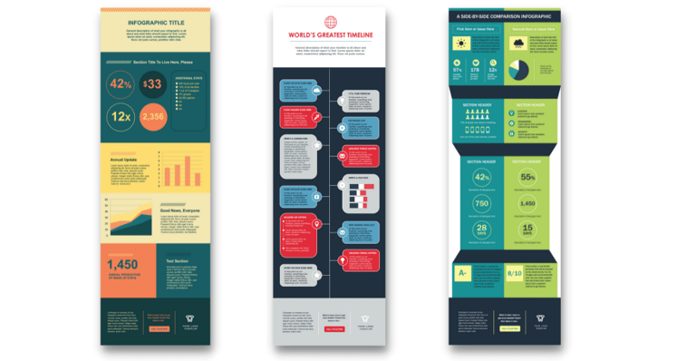
So…how do you create a great infographic? Let’s take a look.
Top 10 tips for creating a successful infographic
1. Make it visually appealing
An infographic is, of course, a visual document. Therefore, ensuring that it is visually attractive is paramount. Images are not only important to tell your story, but with an infographic, they ARE the story.
“Select your visual elements carefully. You don’t want it to look like a refrigerator door with old receipts, lists and photos attached with an assortment of mismatched magnets,” says Luca Marziani, Creative Designer and Senior Art Director. “Be sure each element adds something essential to the overall message and that it has a cohesive look and feel.”
2. Stay on brand
Your infographic should be consistent with the rest of your brand - visually and content-wise. “If your brand has a formal tone, so should your infographic. If your brand is personal or whimsical, your infographic should reflect that,” says Luca.
If you use an online tool such as Canva or Piktochart to create an infographic, be sure you adjust the template to reflect your brand colors, fonts and design style.
3. Use storytelling to convey key messages
The point here is key messages. This is not the place for being verbose. Think of your infographic as a storyboard. Focus on what you really want to convey. What story do you want your audience to hear? Go back to the process you used to find what your true focus is.
The great thing about infographics is that you don’t need to reinvent the wheel. You likely already have a treasure trove of information you can pull from. Think about that 20-minute presentation you spent weeks putting together six months ago that is now sitting in a folder on your computer. White papers, previous blogs, your website, data sheets, and webinars are all good sources of infographic material.
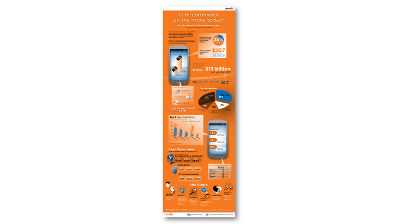
(Infographic for Netsize by Gemalto)
4. Keep your audience in mind and stay on point
Consider what your audience wants to learn and make sure your content is interesting and relevant to them. What is the purpose of your infographic? What is the most important takeaway? “Each element should have a purpose and add to the overall story that you want to communicate,” says Luca.
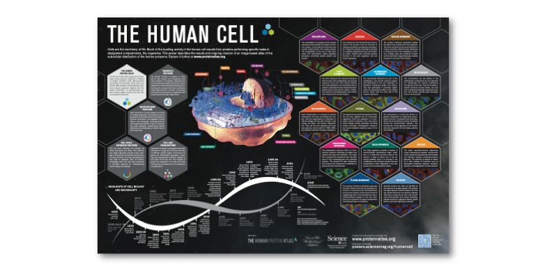
Your infographic will look different and have a different approach depending on who you want to talk to. As an example, the infographic below is a poster with a lot of detail about a complex topic, but it explains it concisely in a way the target audience will appreciate.
(Life science poster for Human Protein Atlas created by Luca Marziani)
5. Make sure the data is accurate
This is very important. Does the data on your infographic match what is on your website, or other communication you have shared? More importantly, have you included sources to back up facts? Present your information not only clearly, but accurately. Don’t try to fool your audience by manipulating the dataset with your graphics. They will figure it out – and you will lose their trust.
If you don’t have the data you would like, don’t just make it up. There are many simple and easy ways to collect data — from Hubspot form builders to Google forms to Survey Monkey, and even things like Mentimeter, which offer easy ways to gather relevant information. Looking to gain a deeper dataset? Consider options such as UP Lab, which can work with you to quickly and efficiently gain the insights you need to create a compelling, original story.
6. Keep sentences short
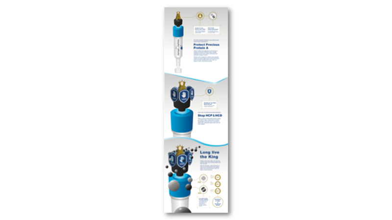
Keep in mind that less is more. You don’t have a lot of “words” in this story, so those that you do use must be concise. Remember, an infographic is “fast” information. Select descriptive (but if possible, short) words that convey information quickly. It’s OK to write in phrases or headlines instead of full sentences. A copywriter can be helpful here.
(Infographic by Luca Marziani)
7. Give numbers special emphasis
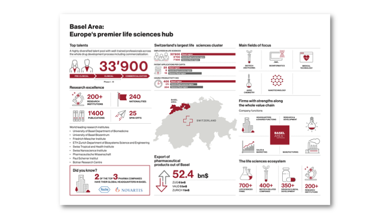
Use numbers as a central graphic focus, enlarging them in various ways to add emphasis and create a story. “You can keep the infographic visually cohesive by using fewer colors, but make it interesting by changing the font size or weight of the numbers,” says Luca.
(Infographic for Basel Area created by UP member Markus Wohlfahrt)
8. Play with fonts
Use font weight and size to put emphasis on important elements and add graphic interest. Just be sure you follow your brand guidelines and stay consistent with your brand style. “Fonts can be used to express your brand in different ways, and the font you choose for your brand can be key in communicating your message,” said Luca. Do you want your brand to transmit tradition…or responsibility…or perhaps a playful friendliness? Typography is key to your brand identity.
9. Keep your use of color simple
Color is great! But you don’t want to go overboard…unless of course, you are in the business of selling paint. Then have at it. What are the colors in your brand book? Stick with those. You want people to recognize your brand in the infographic and then focus on the message – not be left trying to sort out what the infographic has to do with your company.
(Infographic created by UP member Adam McNaught-Davis)
10. Use a consistent style throughout
Using a consistent design, style, font, colors and overall tone of voice will make your content recognizable. It builds trust and helps establish your brand. Nobody goes back for a second helping of unreliable. Infographics are not any different. If it is not cohesive, is disjointed, has incorrect data, or is just plain boring, you will lose the audience you are trying so hard to entice.
Use infographics to educate your audience
Creating infographics that tell a cohesive story, educate your audience and present your brand in a professional and consistent way takes a balance of information gathering, research, artistic skill, copywriting and design ability.
Unfortunately, we haven’t managed to clone Luca yet, but a professional graphic designer can help lend the right level of creativity and design acumen that makes your infographic stand out. If that is not in your budget, you might try some prebuilt templates. HubSpot offers some free templates that can get you started.
If you need help making your infographic look professional, UP has a team of graphic designers and writers that are here to help you.
