Every year, Nielsen Norman Group, the consulting firm headed by user experience guru Jakob Nielsen, holds a series of Usability Week courses in different cities worldwide. Attendees learn best practices in the areas of usability testing, interaction design, mobile development and more.
This is my third year attending the conference, and my choices were Wireframing & Prototyping and Scaling User Interfaces
User testing with prototypes
In the course Wireframing & Prototyping, we learned the foundations of creating web page wireframes and the benefits of testing with these low-fidelity prototypes. The instructor emphasized that early in the design process, it is much more cost effective to design and test a series of rapid iterations in order to decide on critical workflows.
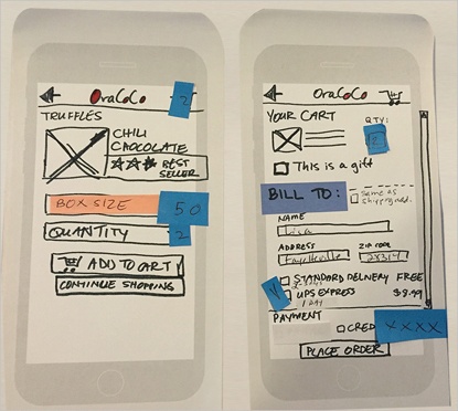
Specialized prototyping software can be used but we saw that simple office supplies such as paper, pens and sticky notes were not only effective, they allowed for a greater degree of team collaboration.

The bulk of the course was dedicated to an exercise whereby the class split into teams, designed a simple website on paper and tested two iterations with our classmates. The test subects navigated the paper website by touching the links they wanted to explore and filled in forms by writing on the paper.
Meanwhile, one person acted as the “computer” and switched pages to correspond to the user’s actions. Though this simple process, we were able to target issues with navigation, functionality and content and quickly change them on the prototype for the next round of testing.
I was a convert and will definitely try this type of development when working on my next website!
Delivering great user experiences across platforms and contexts
Scaling User Interfaces began with the observation that not long ago, providers of internet content could get away with designing for a narrow range of devices and contexts. Seated at a computer, the typical user would spend time exploring a variety of features and content on a large screen.
With the explosion of mobile platforms, UX designers have had to take into account the smaller viewports of phones, tablets and watches, as well as the on-the-go context in which such devices are often used. Today, a major consideration is how to deliver an appropriate user experience across all platforms and usage contexts.
Our instructor noted that it is best to strike a balance with a design that works on both large and small screens, and discussed in detail techniques such as responsive and adaptive web design which allow this to happen.
She also noted that while appearance is important, content and user needs are the main factors to consider, and that information layout must match the content priorities for each device.
An example is that while computer users can comfortably execute all tasks, tablet users usually engage in content consumption, while mobile users are looking for specific information like directions or use their devices to communicate.
In order to determine the appropriate design directions for each of these cases, web analytics and user testing are a must.
Jakob Nielsen Keynote
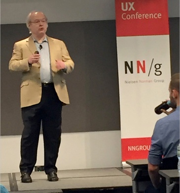
In his keynote address to the conference, Jakob Nielsen compared findings from two major web usability studies his group conducted in 2004 and 2016.
 The research, which spanned e-commerce, banking, news and other sites, found that in general, user experience has evolved in a positive way.
The important metric of task success rose from 66% to 82%, although he wryly added that 82% success still meant a failure rate of 18%.
Mr. Nielsen also noted that while a climb in user task completion is to be applauded, the ultimate goal is “successful and easy”.
Findability, that is, the ease with which information can be found, remains a problem on many websites. As an example, he referred to “the curse of the splash page”, that is, the current trend of creating home pages with huge, beautiful photos and little useful information.
Mr. Nielsen went on to discuss the importance of optimizing user studies. He stressed developing and testing the correct personas and their different contexts of use. In closing, he reminded the audience that “design is not enough” and that UX concerns should remain at the forefront of website development.
In addition to providing me with a wealth of usable information and techniques, Usability Week NYC allowed me to connect with a wide variety of UX professionals sharing the same usability concerns. In all, a very valuable way to spend a couple of days in New York!