Netsize is the global leader for mobile operator micro-payment solutions and messaging services, with offices in 21 countries. In October 2012, its parent company Gemalto acquired Ericsson Internet Payment Exchange (IPX) and merged it with Netsize. UP was commissioned to extract and combine the key strengths of both companies, repositioning them as a single brand to reflect the new Netsize.
Location
Sweden
Sector
IT, technology & industry
Service
Branding & communications / Digital marketing
Background
Netsize is the global leader for mobile operator micro-payment solutions and messaging services, with offices in 21 countries. The company enables web micro-payments that can reach over two billion consumers on the move, as well as personalized messaging for six billion consumers on the move worldwide. In October 2012, its parent company Gemalto acquired Ericsson Internet Payment Exchange (IPX) and merged it with Netsize.
The brief
UP was commissioned to extract and combine the key strengths of both companies, repositioning them as a single brand to reflect the new Netsize. The newly merged organization had all the ingredients to be a leader in this dynamic and ever evolving sector. We were tasked with putting this new company on the map.
The solution
We set out to leverage the strengths of both the payment and messaging businesses, and anchor them under the refreshed “on the move” positioning. We led several workshops for the Netsize leadership team, conducted research around traditional and new players in this space and worked closely with the client to develop a refreshed brand strategy, creative platform, and integrated communications plan.
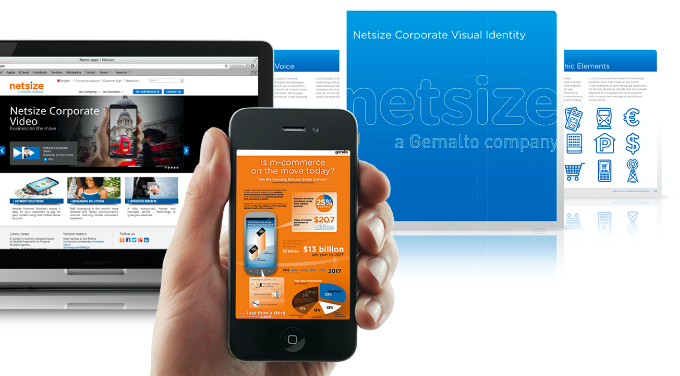
We delivered more than just an updated identity and positioning, which were fully outlined in a new brand and corporate visual identity guide. We completely overhauled and redesigned the website, created new corporate brand films, infographics, presentation templates, sales promotion materials as well as online banner advertising.


The results
The logotype conveys a modern, contemporary look and feel, reflecting the new “on the move” positioning. Its orange and blue color ways differentiate the brand from its current competitors, and connects back to the Gemalto parent company.

Let's connect

Find your local creative hub

California
Creative Space to come soon