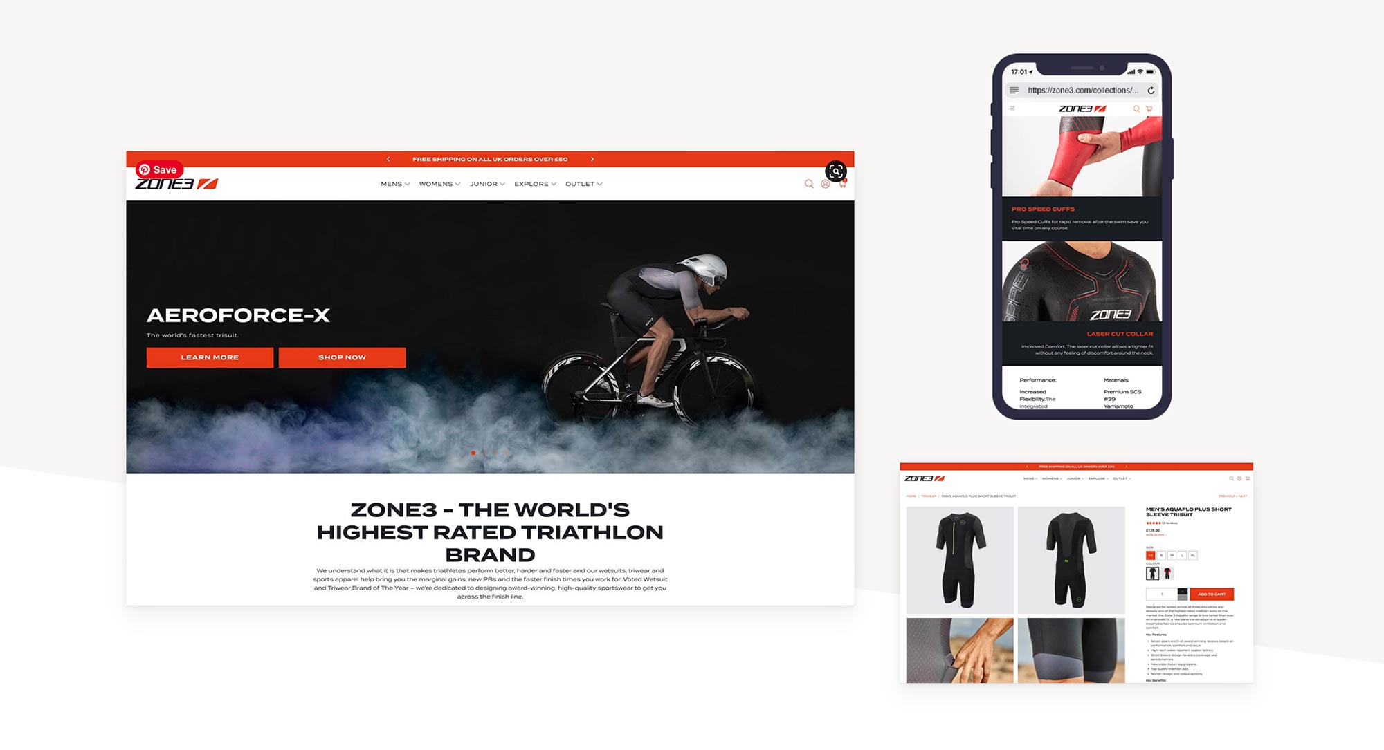
Zone 3 is the world’s highest rated Triathlon brand, an amazing statement and journey for the UK-based company that manufacture wet-suits, tri-suits, swimwear, and all the training/competing accessories that the modern triathlon athlete needs.
Location
United Kingdom
Sector
Consumer
Service
Websites & ecommerce
Background
Zone 3 has a hugely popular online store that has a number of localized variations for different territories.
The brief
The Zone 3 team wanted to be certain that they were getting the most from the store so they approached UP for Digital to run a full site review and analysis. The report highlighted a few areas which could be improved, and also a number of pieces of functionality that the old site was missing.
The homepage, product pages, and collection pages all needed work and all needed additional functionality added.
The solution
After assessing all the options it was decided that following the tried-and-tested UP for Digital process would deliver the best results for the new site. We could have edited/worked on the old design, but starting with a new, fresh layout and design would mean we could optimize every element within the site.
Following our process, we created some high-fidelity wireframes/prototypes for each key page that the Zone 3 team could test and refine. These then got migrated to the new user interface design for the new site, following the brand guidelines supplied from Zone 3.
The site is built on Shopify Plus, Shopify’s premier platform, so implementing the design was relatively straightforward. We had a staging site to implement the new design before rolling it out across the various localized sites.

The results
There are so many new features packed into the site, but along with better SEO, we have implemented a new uncluttered homepage with rich lifestyle imagery, clear male and female user journeys for the six product categories, improved mobile performance, simplified menu structure, three column product page with video, additional product sections on each product page, and clearer customer reviews.
Let's connect

Find your local creative hub
