The brief
The marketing team at Grayce found themselves in a position that’s certainly not uncommon in many established businesses. They wanted to show the business a clear ROI, deliver leads and enable sales but a lot of their tools were working against them.
Their branding had become dated and difficult to manage, with a lack of clear guidelines. Digitally, their website had similar problems. A culmination of a lack of flexibility with their CMS, low performing SEO and a tone of voice that didn’t resonate with their target audience. It was time for a total refresh.
The Grayce team had their hands full elsewhere, so invited UP DIGITAL to help deliver solutions
The solution
Our first port of call, once a clear brief has been aligned, is research and analysis. This helps us to understand where Grayce stood in the digital landscape from Google’s perspective. We also analysed their competitors and their digital positioning to help us find the right place for Grayce.
Next we spent time developing an understanding of their audience:
- Creating personas
- Identifying their lead’s online searches
- How to make sure Grayce is discoverable to the right people
SEO
We curated an SEO strategy, an internal index of business terms and most importantly, established what they wanted to be found for online.
The first step was updating the meta title for Grayce’s website. Originally, it was ‘Agile Transformation Support’ which unfortunately had no searches. We optimised it to ‘Graduate Programmes to Resource Change Management’ – which is a much clearer proposition.
Branding
Now we knew who we were talking to, and had identified the right tone of voice, it was time to refresh their branding to give the best first impression.
Our fantastic design team got to work on developing concepts for the brand refresh. We weren’t completely rebranding the business but bringing it into 2020.
A new logo, colour palette and guidelines modernised Grayce. With clarity on their new branding, the team were inspired to see how the business could present itself. Better yet, they felt it was now possible to compete with big players in the industry.


Website
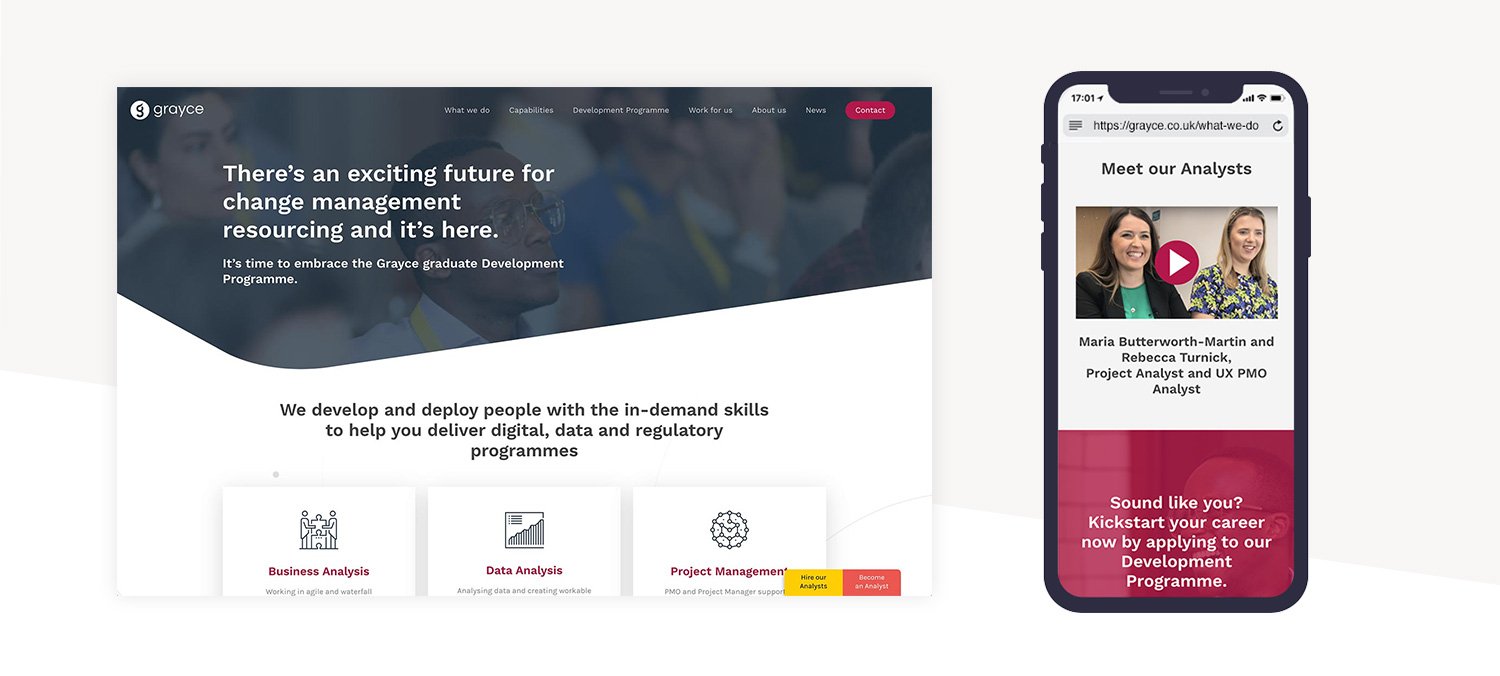
Onto the website. We followed our tried-and-tested process for design and build. The first step was to align a new sitemap to help plan pages, flow and lead journey.
Once approved, we created wireframes that worked as an interactive prototype. This allows us to test user journeys and information architecture.
We designed their online brand book. Once the Grayce team were happy, we applied that across our wireframes and we were ready to start the build!

The result
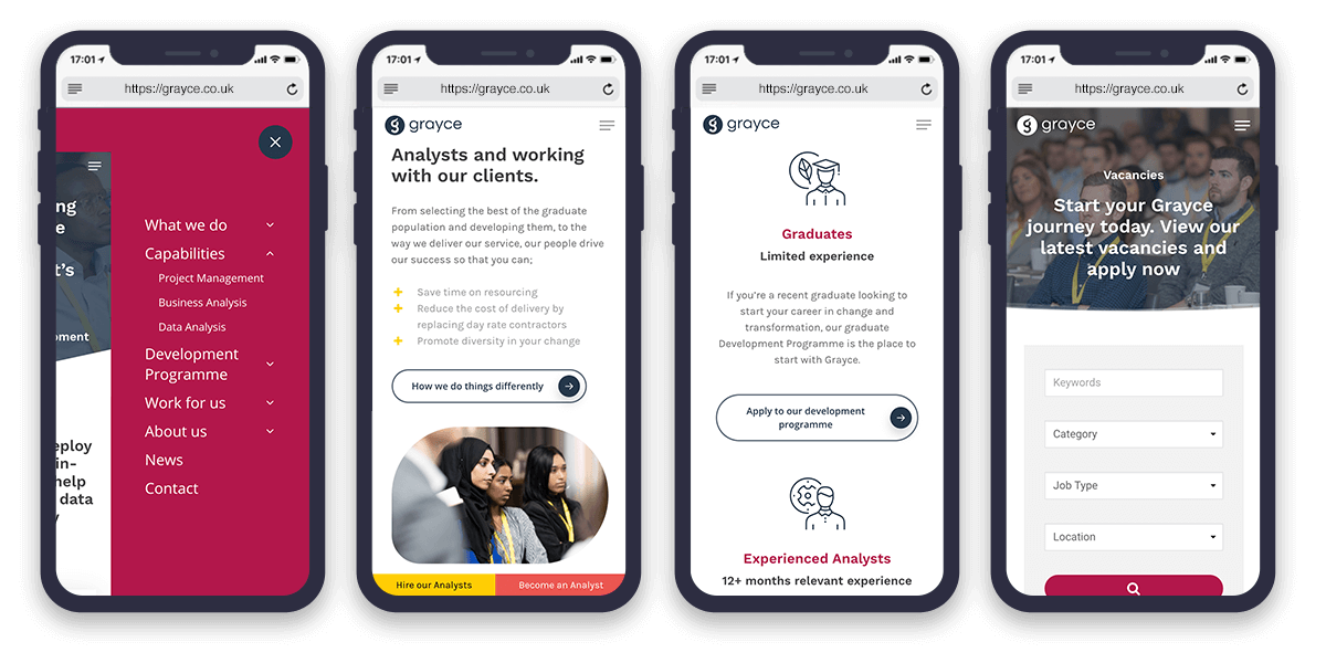
Grayce now have a well built, easy to manage and supported website built on WordPress. They are now able to deliver and support campaigns with a rich website that they can continually update.
The revitalised branding allows them to create beautiful comms, representing them as a growing, dynamic business.
Grayce now have the right foundations in place to land key messages in communications, both digital and offline. They can maintain a consistent brand look and feel, and use solid technology to deliver campaigns efficiently.
Reviewing the sites core analytics, we can see that year on year, there has been:
- a 100% increase in users and new users, page views and sessions
- a bounce rate of 36%
- huge increases in duration on the site

Let's connect

Find your local creative hub
